The best way to create a digital planner is to start with how it will be used (tablet + stylus, desktop, or both), then build a simple, reusable structure: a clean yearly overview, monthly spreads, weekly pages, and a notes system. From there, add navigation (tabs and hyperlinks) and only the features that support real routines—like habit trackers, project pages, and meal or budget layouts—so the planner stays fast and easy to use.
Most digital planners are designed for apps like GoodNotes, Notability, or similar PDF annotation tools, so an interactive PDF is a reliable starting point. If the planner is meant to be edited like a document, a slide-based format can work, but PDFs are typically smoother for writing and tapping through pages.
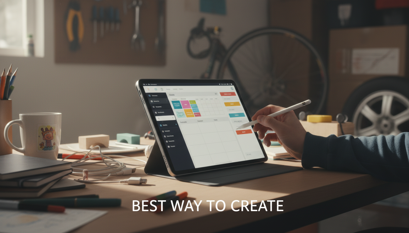
Decide what’s included and how many pages you need before polishing visuals. A common flow is: cover, year-at-a-glance, monthly (12), weekly (52), daily (optional), notes, and specialized sections (goals, fitness, budgeting). Planning this early prevents broken links and inconsistent layouts.
Use generous margins, clear headings, and light grids or dot guides that won’t compete with handwriting. Choose 1–2 fonts and a limited color palette for readability. Keep tap targets (tabs and buttons) large enough for fingers, not just a mouse.
Hyperlinks are what make a digital planner feel effortless. Link month tabs to each month, add “back to index” buttons, and connect weekly pages to their matching month. Test every link on the device it’s intended for before exporting final files.
Export a draft and run a real week with it. If you keep zooming, rearranging pages, or ignoring sections, adjust the layout. For a deeper walkthrough and design considerations, visit the full guide on creating a digital planner.
A design app (like a page-layout or slide tool), a way to export to PDF, and a note-taking app to test usability are the essentials. If you want clickable navigation, you’ll also need hyperlink support in your design workflow.


Leave a comment